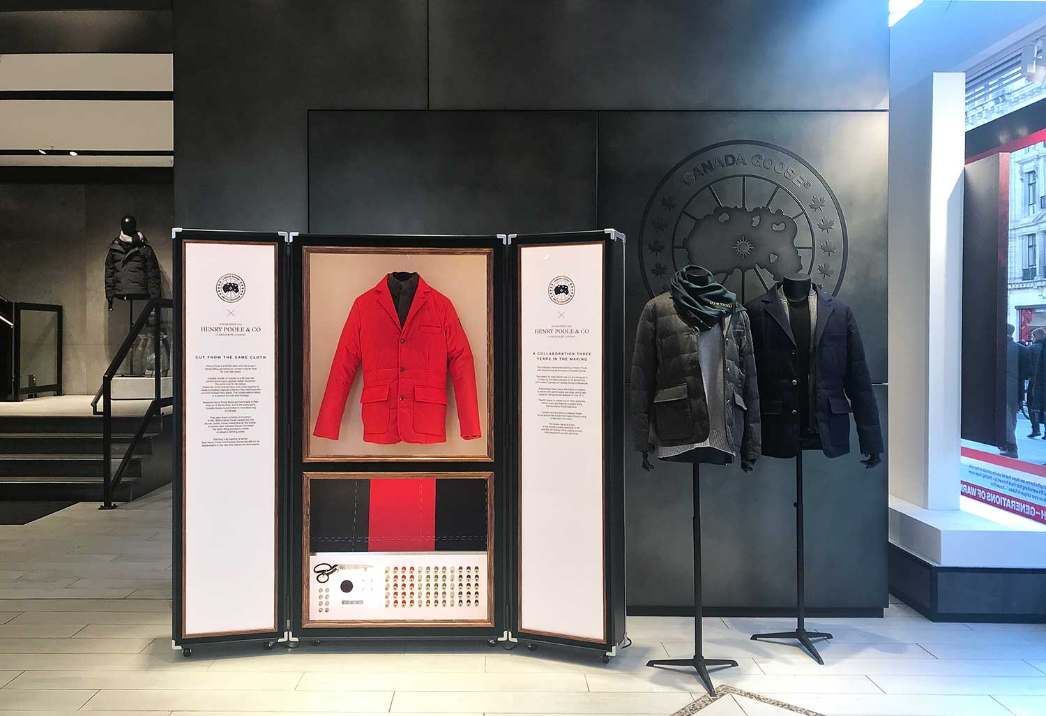
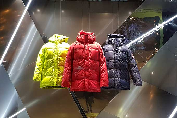
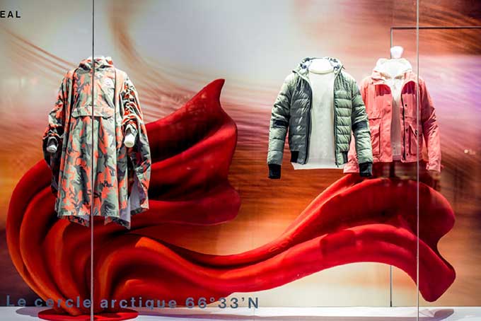
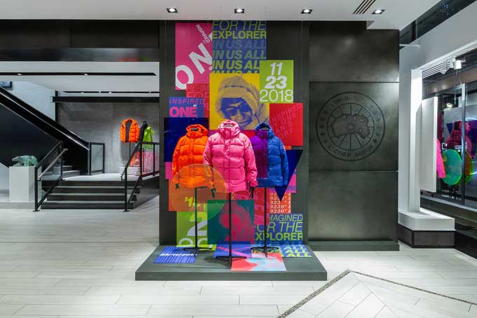
- CG Installations
The brand is best known for its distinctive red, white and blue circular logo, which is a "reverse image of the North Pole with the white representing the ocean while the islands are depicted by blue patches, encircled by lines of longitude and latitude to approximate the look and feel of a traditional Arctic Map. The outer ring of the logo contains "CANADA GOOSE" on the top and "ARCTIC PROGRAM" on the bottom, while each side has five maple leaves.
Canada Goose
Creative Direction
Guerrilla Creative
